Blog

CSS GOLF

What's this about?

I'm a big fan of CSS code golf. The idea is to replicate a given image using only css and html, in as few characters as possible. I play it here. If I score in the top 10, I'll write about it. I'm not good at writing so keep the expectations nice and low.

Here are some general tips:

  • Minify everything
    • whitespace
    • newlines
    • last semicolon
    • last closing bracket
  • Find the shortest possible unit. This means dropping the unit altogether for some properties like margin and padding. Eg: margin: 5; instead of margin: 5px. Use percentage or q value. Some examples:
    • 20px = 5vw
    • 40px = 5ch
    • 10px = 11Q
    • 50px = 54q
  • Use the shortest possible selector. Eg:
    • html = &
    • body = &>* (although careful with this one if you change the display property of the body)
    • With CSS nesting you can usually get away without classes to select elements by chaining them together with siblings selectors in nested rules, but if you do need a class, rather use a single letter attribute as a selector. For example, instead of this: do this:
    • Not sure how exactly this is used yet but there's a trick where people use this unicode character in combination with some font shorthand to set the font size like this Which can be used to set up the size of an element without using height, width, or padding. Not sure why, but it seems like you can't always copy/ paste this character. Here is the unicode information about this character: "U+00A0 : NO-BREAK SPACE [NBSP]". It seems like the non breaking space character gives the element it is in height. It's not a regular space, which the browser will parse and remove from the DOM if it has no siblings. Often people use this character with a tag. From what I can tell, this is because that heading tag has a default font size of , which gives it extra height.
    • Instead of using the keyword in making a radial gradient, use the shortest length value ( ). This also allows you to drop the last 0 for the last color stop in the gradient.

Target (30/05/2025) - 6/10

Target (30/05/2025) - 6/10

Solution (214 characters):

Breakdown:

This is the markup we add to the page, which gives us 2 paragraphs with an image in each.

Here are the styles, unminified:

Some of the tricks used in this one:

  • use 11q instead of 10px for the border radius
  • set the color property, so we don't have to repeat it for each box shadow
  • drop the # from the hex code for the color property
  • use 5vw for 20px
  • use 5ch for 40px
  • use 30vw for 120px
  • use 85Q for 80px
  • use inset 0 0 0 1in for the first box shadow instead of declaring a background color

Target (31/05/2025) - 6/10

Target (31/05/2025) - 6/10

Solution (134 characters):

Breakdown:

The idea here was to use 4 elements that all have a rectangle on their left and right sides. The shortest way I know of doing this is with border-inline or border-block. So we give every element (html, body, p, and img) the border styles and background as well as a rotatation. Then there is just margin for positioning and padding to set the size of the img tag.

Markup:

Here are the styles, unminified:

Target (04/06/2025) - 5/10

Target (04/06/2025) - 5/10

Solution (111 characters):

Breakdown:

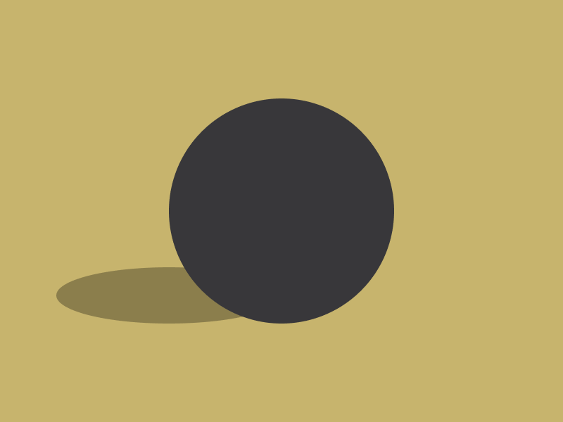
No extra markup was added in this challenge, only used the html and body elements that are already on the page. My plan with this challenge was to create 2 circles with the same background. The shortest way I know this can be done is with a radial gradient as a background image. I'll break down each part of the background rule, seeing as it's the only rule other than the margin used for positioning the body element.

Here is the background shorthand rule, broken up into it's parts:

So the first part is the background image where we have a radial gradient, and the first part of that is the . This is the shape of the gradient. Instead of putting , we can save a few characters by using the length value instead. As mentioned on the MDN page linked above:

When the keyword is omitted, the gradient shape is determined by the size given. One value provides a circle, while two values in units provide an ellipse. A single value is not valid.

Next, we have the gradient code, which uses hard stops to give a solid gray circle on a green background. Then we have the position x and y which is self explanatory. The last important part of this is the background size. I've made this larger than the viewport height, to prevent the circle of the background from being repeated. The alternative to achieving this is giving it a background attachment of fixed (more characters), or setting the background size to be smaller than the viewport (which won't work because it cuts of the green background).

Here are the styles, unminified:

Target (05/06/2025) - 7/10

Target (05/06/2025) - 7/10

Solution (130 characters):

Breakdown:

This was a pretty simple challenge. The idea here was 3 elements with the same dark blue background and a light border. Only a tag is added, giving us 3 elements total. The html element is given a border radius for the rounded part of the image, and other than that there is just margin for positioning and a height given to the tag.

Here are the styles, unminified:

Looking at the top solutions for this challenge, one major difference stands out to me. Take a look here:

There is no height set for the element added to the page. This saves quite a few characters. The use the non breaking space unicode character which gives the element its height.